
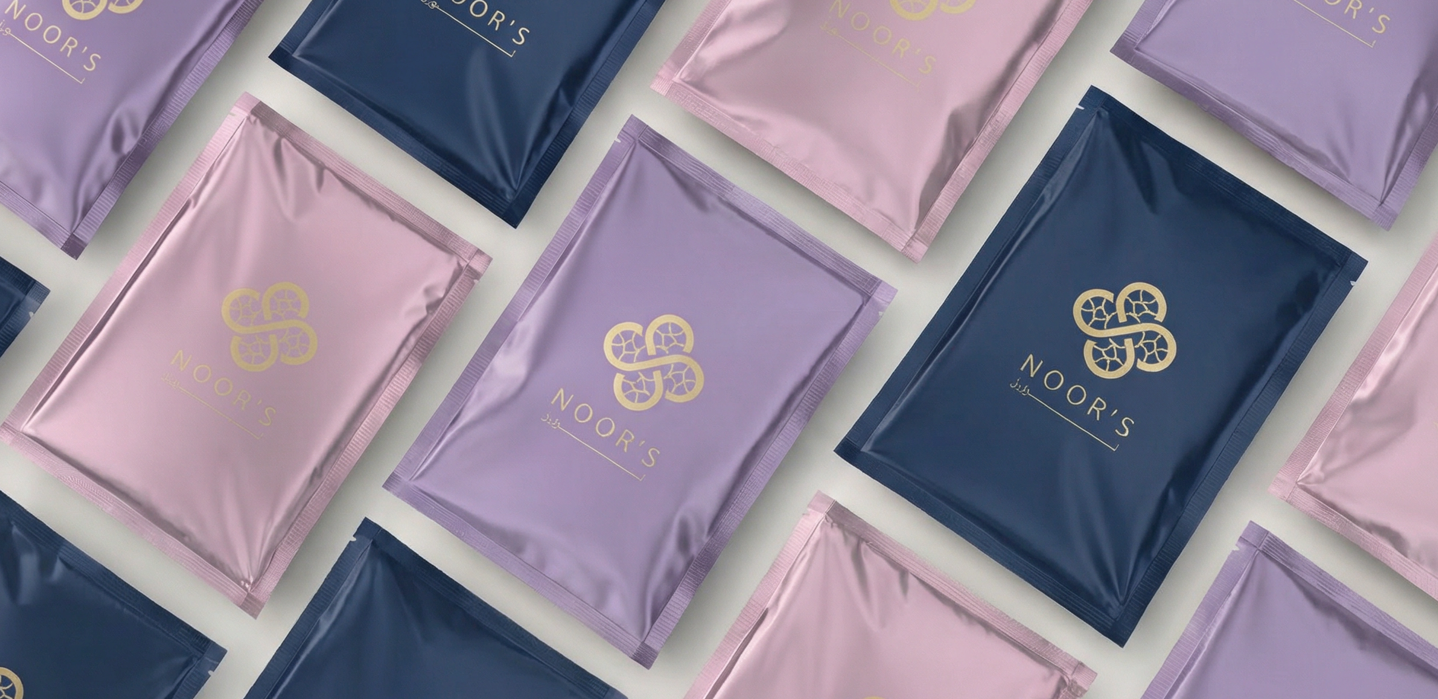
NOOR’S
Client
Invisible BoxChronologie
2 WeeksService
Brand Identity Social Media DesignProject
NOOR’S
Project summary
NOOR’S is an eco-friendly, naturally sourced beauty brand with a mission to help people feel beautiful in the most natural, light, and authentic way — without heavy or artificial looks.
A logo built with purpose
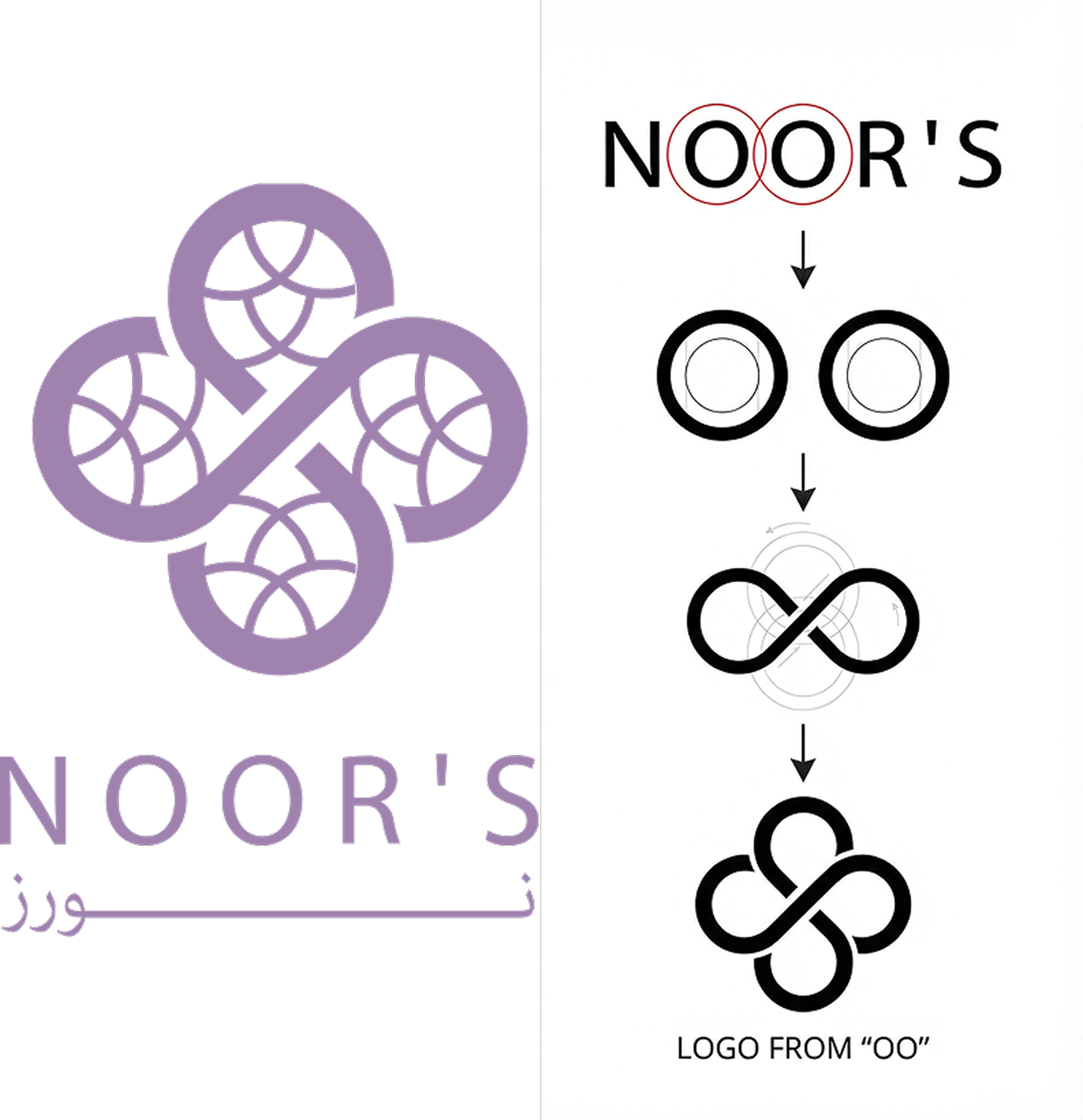
The logo was born from a refined and symbolic design system. Inspired by the two “O” letters in the brand name “NOOR’S,” we duplicated them into four circles — a minimal, elegant pattern that became the foundation of the visual identity. 4 circles = Pure, balanced, natural system Grid = Soft geometric structure representing transparency and the brand’s eco-friendly formulas This fusion of form and meaning creates a brand that feels both luxurious and responsible.
Trust through innovation
The visual system blends minimal geometric forms with organic colors and textures to enrich the brand story. Lightness & freshness — no artificial boldness Sustainability — grid-based design reflects earth-friendly values Elegance — premium feel rooted in simplicity The identity is a visual reflection of NOOR’S core values.